
 Recent Work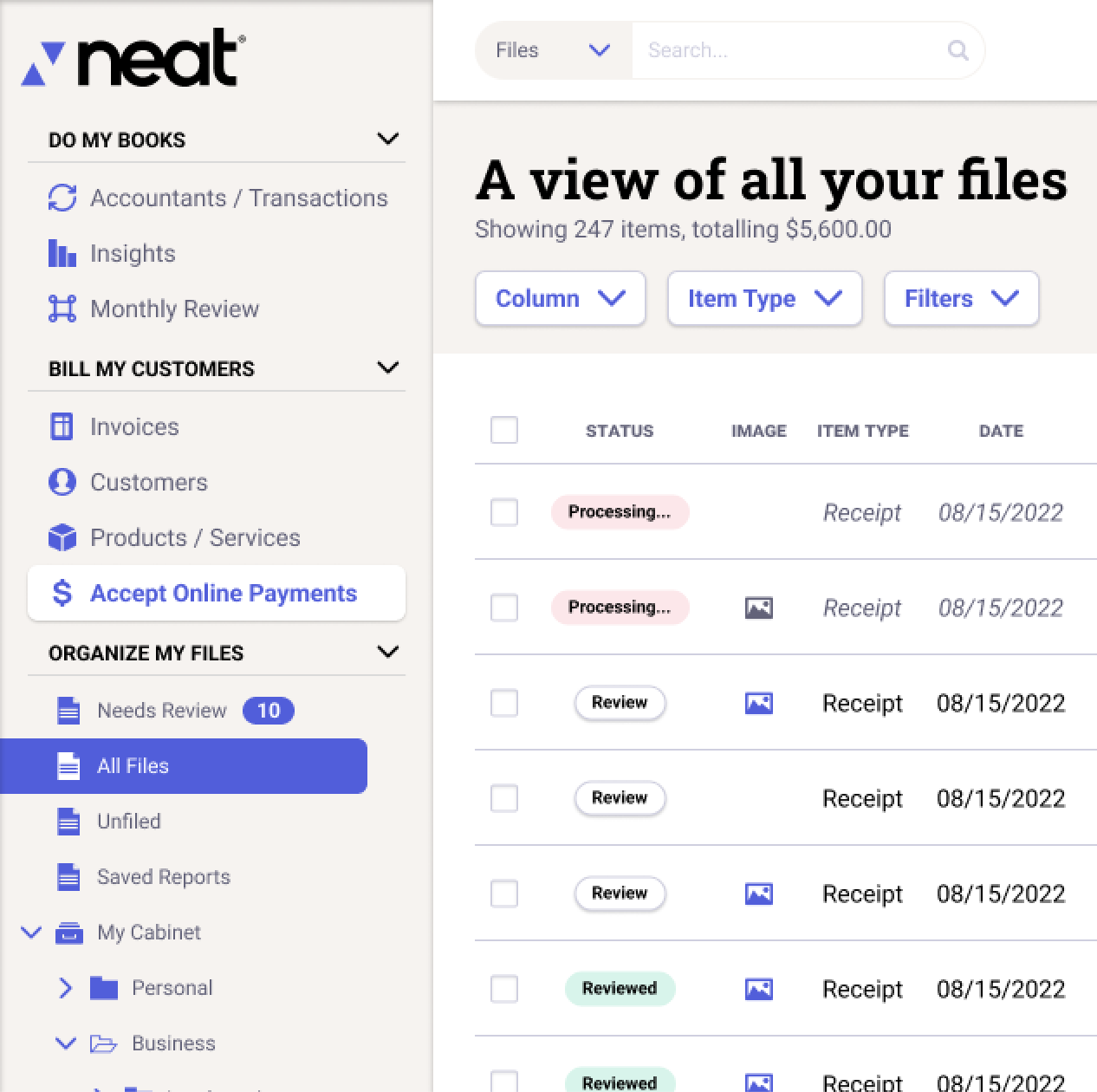
Recent Work at The Neat Company
At the Neat Company, I do primarily user experience design for their mobile and desktop application.
Scroll to explore some examples of my work below, or click to jump to something specific:
Scroll to explore some examples of my work below, or click to jump to something specific:
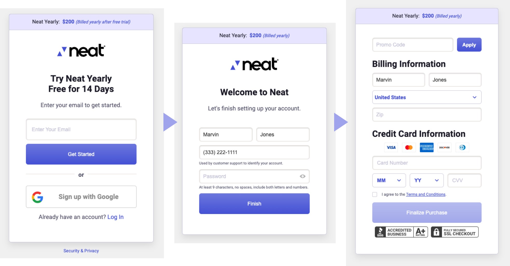
When Neat changed their credit card processing from Magento to Recurly, we decided it was time to create a completely custom checkout experience, tailored to our current smaller product line.
We decided to break the flow up into bite-sized chunks, and only ask the user for information that was absolutely necessary.
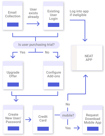
I created a flow diagram outlining the technical requirements and needed branches of the experience. Once the flow was settled, I created a high-fidelity prototype to allow stakeholders to review every step of the flow, and updated with necessary changes.
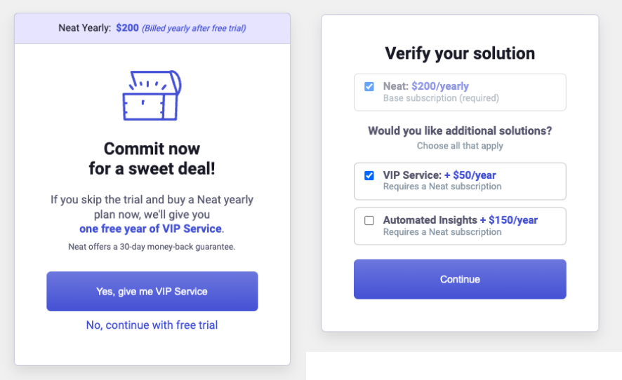
Marketing wanted to upsell customers on expanded services when possible. To do this, I designed 2 new screens.
Trial purchasers would be given the option of a discount if switching to a paid version in checkout. Customers paying for a plan would be able to add additional services on top of the base plan.
Several versions of these designs were created to hit the right mark of simplicity and friendliness.
Because Neat is a small company and our development team was busy with our application, I was tasked with building and coding the checkout flow. I coded the entire front-end, including integrating Recurly payment processing and querying our back-end API for user and product data.
Once the checkout flow was live, we were able to view customer interactions using FullStory to keep an eye out for any issues.
Since the initial launch, updates continued. Recently the coupon code box was revamped to be clearer and update more interactively.
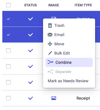
For combining documents, the option was added in the context menu but remained greyed-out unless more than one document was selected on the main grid. Testing showed that some users were discovering this, so buttons were also added to the footer of the main grid.
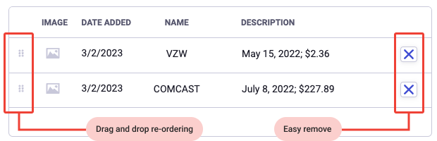
After combine is selected, the user is shown a list of the items selected, with the ability to easily remove and re-order them before the final combine operation happens.
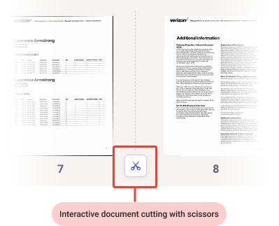
Creating a usable way to separate multi-page documents into separate files proved to be more challenging. After a few clunky and over-complicated first tries, I discovered a scissors metaphor gave users an intuitive understanding of how to do the separation.
Uses could click the scissors button at the gap between page thumbnails (see demo above) and easily see how the document would be broken up.
After choosing how to separate, the user is able to choose the location in Neat for each new file.

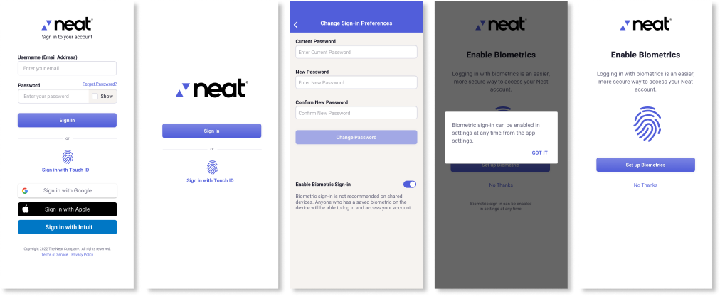
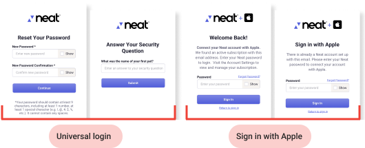
Neat's login flow was different on their desktop and mobile apps. They wanted a single flow that could be used for both. This included the new ability to sign in with Apple and log in with face or fingerprint in the mobile app.
I created prototypes of the different possible login flows, including all relevant screens, accounting for differences in Android and iOS, and configurations where biometrics is turned off.
In addition the ability to turn biometrics on or off in settings needed to be considered, so I created a flow showing how to do that.
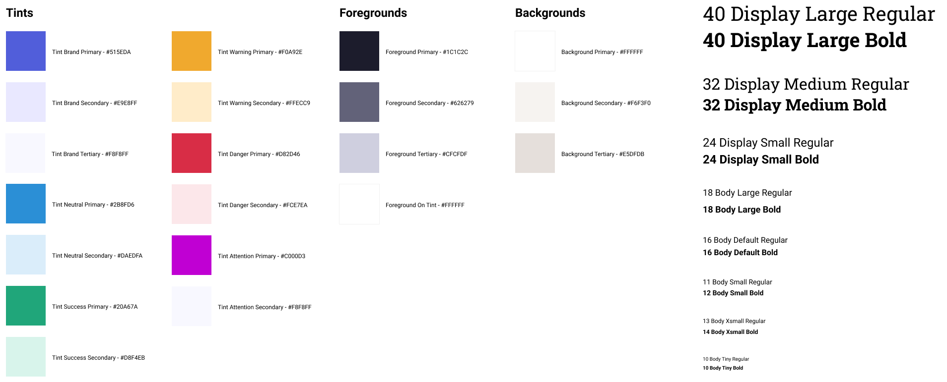
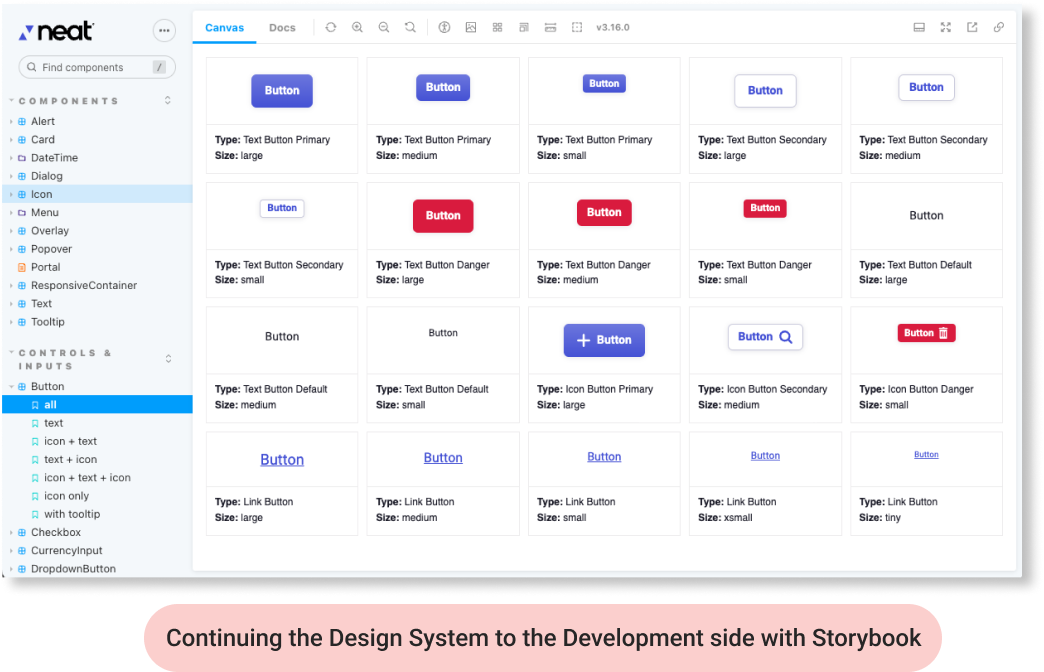
In order to streamline the process of creating new functionality on both the design and development side, I manage the Neat design library. Whenever new functionality is needed, care is taken to decide if existing elements can be used, or new ones are needed.
Base elements, such as buttons, are configured to have a wide array of different states and configurations. All of these are developed and tracked in Figma (previously Sketch).
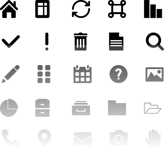
Element specs can be taken from the design system files for developers to use. I export files such as icons when needed for the developemnt team.
Recently, I have been taking an extra next-step and working directly on the development side, importing icons directly into their Storybook software and even creating code for new component functionality.
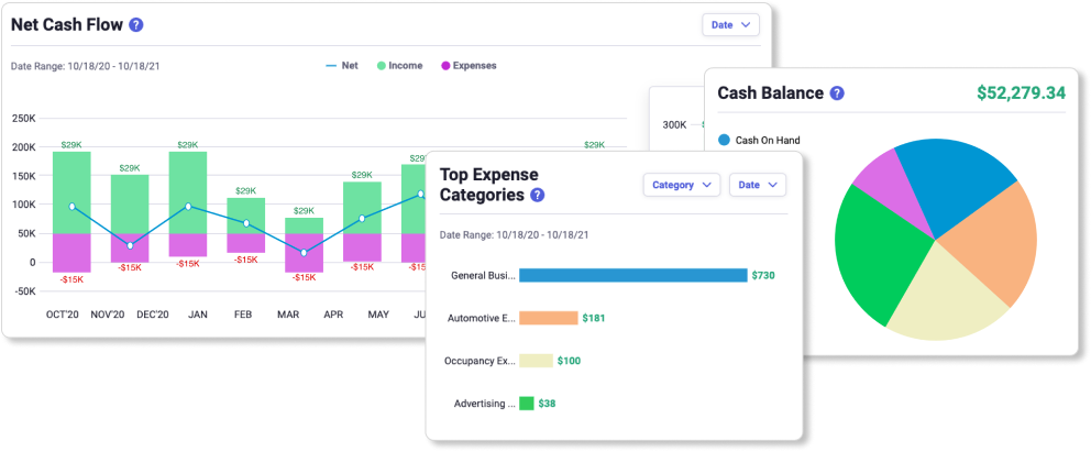
I created design comps for the initial rollout of Insights, which allow users to interactively view important metrics.
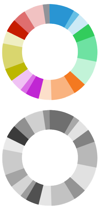
I worked with the development team to make sure the designs were consistent with the abilities of their charting tool. I developed a color scheme and ordering that would be readable for the color-blind.
Later, additional features were introduced, such as the ability to bookmark a commonly used filter configuration. I created prototypes showing the flow for that.
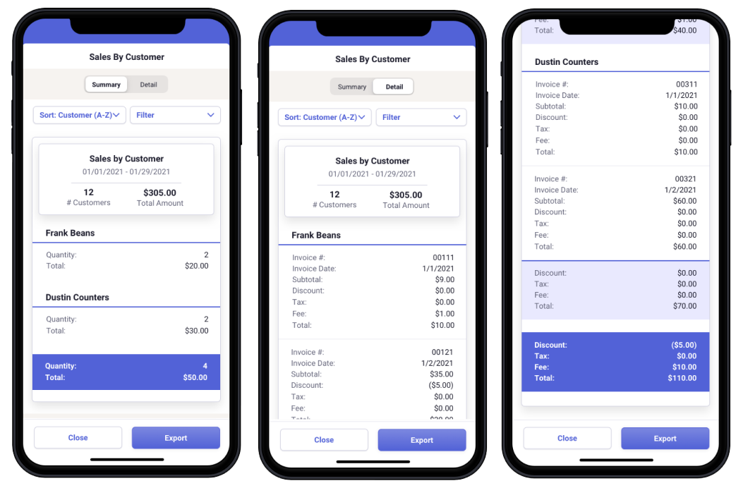
I also did a lot of work on Reporting. Below is an example of how some reports, which take up much of the screen on destkop, were reformatted to be more easily viewed on mobile.


Attention
This site is a work in progress!
More examples coming soon